
Student-School Suitability Sub-scales auto-generate instant free brief sample charts and detailed SAS, CPS, SCPS and SOS reports available to view. All of the reports published on our website are generated using our unique 20 step “Survey Builder” and report-writer tool. All our reports have a similar professional format. Each standard report produces two graphs and a table with supporting interpretive text. The PSM matching report has three large tables that provide multiple points of engagement on a pupil by school basis.
Student scores are averaged and expressed as a percentage of the total possible score displayed on a line graph. Individual student scores on nine (9) psychological attributes related to schooling suitability are charted with those of their peer student cohort to:
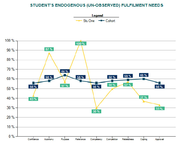
Differences between individual student scores and peer cohort mean scores profiles student attribute strengths and limitations.
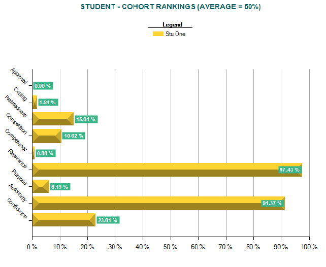
Student percentile rank scores are display on a bar graph. This graph shows in percentage points the relative strength of each attribute compared to their peer cohort. Both high and low rankings are of interest when discussing strategies for intervention.
This table shows standardised student attribute scores compared with peer cohort scores. Tests for significance are made at the .90 level (probability of error is 10%) and results are displayed as:
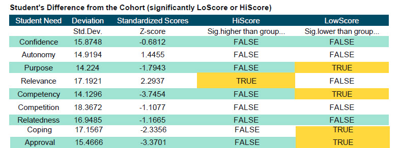
When the student score is significantly different from their peer cohort this is indicated by the word “TRUE” in the table, while the word “FALSE” indicates that the student is within normal range.
|
Copyright 2024 HiScore Privacy Disclaimer Sitemap |
|